2GZ introduced the concept of partial ownership of commercial property, enablingthe entry of smaller investors in the Commercial Real Estate market.
I designed an invetment platforms that allows people to own a small part of a commercial property. With the investment starting at Rs10,000, anyone can now invest in the commercial real estate. Being the first of its kind, the challenge also included educating people about this concept and inspiring confidence among them to get them onboard.
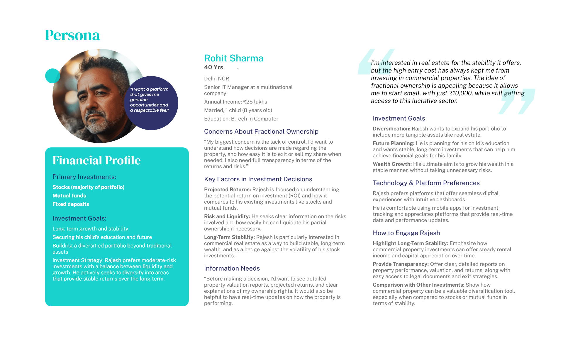
We started by interviewing potential investors, primarily middle- to high-income professionals in the Delhi NCR region, focusing on their motivations and concerns around investing in commercial property. These conversations revealed their interest in fractional ownership, allowing them to invest without the high upfront cost.
Alongside user interviews, we analyzed investment platforms such as Zerodha and Groww to understand their strengths in user experience, transparency, and trust-building. We noted that while these platforms offered real-time asset performance data and easy navigation, there was a gap in the market for a real estate platform offering fractional ownership of commercial properties.
Our most significant finding was that the potential user base was far broader than expected. Beyond mid-level professionals, younger investors, retirees, and small business owners were also interested in fractional property ownership. This widened our target audience considerably.
We synthesized these insights into a single user requirement statement:
The insights we got from the interviews include
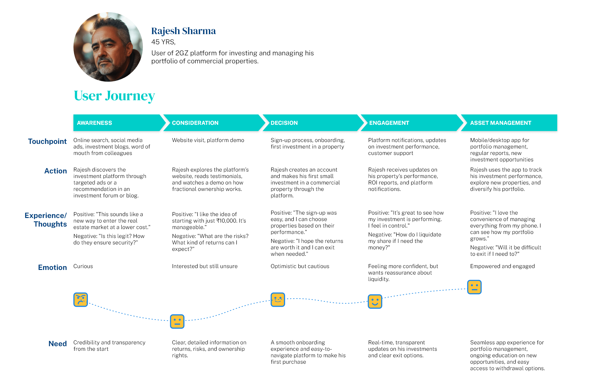
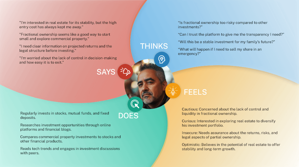
Insight: Users will have different comfort levels for investment amounts, revealing their risk tolerance or preference for liquidity vs. long-term growth. This helps adjust messaging to emphasize affordability or future benefits.
Insight: Users may distrust fractional ownership, citing concerns over liquidity, transparency, or control. This highlights the need for clear communication about ownership rights, exit strategies, and returns.
Insight: Some users want detailed data (e.g., property valuation, returns), while others prefer user-friendly dashboards. This insight helps the platform decide how to present data and keep users engaged.
Insight: Users may compare commercial property to stocks or bonds. If seen as riskier, the platform should highlight its advantages like stability and income; if viewed as a diversification tool, it can be positioned as a portfolio complement.
These insights help refine the platform’s features and marketing to better match user motivations and concerns. Based on this data we created a few documents to guide us during the design phase.
The key message behind our branding was simple yet powerful—partial ownership. Rather than focusing on financial returns or traditional investment narratives, we wanted to emphasize the unique value of allowing individuals to own a piece of something bigger—commercial property. This core message was designed to set us apart and resonate with users who may have felt excluded from this market due to high entry costs.
Our approach to the logo was guided by two principles: simplicity and recognizability. The logo needed to be clear and distinguishable, even at small sizes or in poor resolution, ensuring that it would stand out across various platforms and devices. The imagery was crafted to evoke a sense of opportunity—
This metaphor of ownership and possibility was central to the brand’s identity, creating an emotional connection and a sense of empowerment for users. The logo serves as a visual reminder that they are part of something significant, no matter how small their initial investment.
When designing the logo, we explored multiple concepts to reflect the core essence of the brand. The idea of partial ownership was central to our design approach, symbolizing how our customers can own a piece of something larger. We wanted the logo to visually communicate this sense of shared ownership, making it immediately recognizable and meaningful.
Another concept we considered was the significance of the number 2, a nod to the idea of duality—two parties involved in the transaction, or the 2 from the 2 Gaj Zameen. This subtle incorporation of the number created a sense of partnership and collaboration between the platform and its users.
![]()
Finally, we explored the measurement aspect derived from the name, symbolizing precision, control, and the careful management of investments. This idea was represented in clean lines and balanced proportions, conveying a sense of reliability and trust.
These concepts came together to form a cohesive logo that reflects the brand’s unique value propositions—ownership, partnership, and precision.
The final logo design was a simple yet powerful visual metaphor. It featured two circles: a large one representing the world or the commercial real estate market, and a smaller one that fit perfectly into a hole of the same size within the large circle. The idea behind this design was to convey the concept of partial ownership—the larger circle symbolizing the broader real estate market or a specific project, and the smaller circle representing the part owned by our customer.
This design visually communicates the essence of our platform: that every customer has a tangible piece of something much larger, reinforcing the brand's focus on ownership and inclusion in the commercial real estate space.
![]()
Our design journey began with a focus on creating a sense of wealth creation and financial achievement. We (I was the only designer on this project. I am waying we because of the collaborativ approach we took with the stakeholders. We dicussed ideas, debated over their merit before making decisions) initially explored a polished and sophisticated visual aesthetic, using high-quality photographs to communicate these themes. This approach aligned well with our goal of establishing trust and credibility, delivering the polished look we wanted.
However, as we progressed, we shifted towards an illustration-based design. The primary goal of our platform was to educate users about fractional ownership in commercial real estate. Illustrations proved to be a more effective medium for this, allowing us to break down complex concepts in a visually engaging and approachable manner. This shift helped us connect with our audience more effectively, balancing professionalism with accessibility.
Multiple design iterations ensured we found the right balance between clarity, aesthetics, and user engagement, resulting in a platform that is both educational and visually appealing.
When it came to designing the platform, our approach was once again guided by extensive research. We revisited other investment platforms, analyzing how they displayed critical information. Through multiple discussions, we carefully identified what data was most relevant for users and how it could be presented in a way that fosters easy decision-making.
Our main challenge was balancing the wealth of information available with the need for simplicity. The platform had to provide enough data to empower users to make informed decisions, but without overwhelming them. We designed the interface to be intuitive, ensuring that key insights were easy to access and digest, thus helping users feel confident and in control of their investments.
This thoughtful design process allowed us to strike the right balance between providing valuable information and ensuring the user experience remained seamless and stress-free.